The full source code for the Data Analysis Demo is available on GitHub
Data Analysis Demo
The Data Analysis Demonstration, written by Mark Hazleton in the early 2010s, is a powerful tool that showcases how .Net tools can be used to analyze data in the Comma Separated Variable (CSV) file format. While many software applications may become outdated over time, the Data Analysis Demo continues to be a relevant demonstration of data visualization in .Net web applications.
Data analysis and visualization are critical components of any business or research project. Understanding complex data sets can be a daunting task, but visualizing the data can make it easier to identify patterns, trends, and relationships. The Data Analysis Demonstration is a web application that simplifies the process of data visualization and analysis by providing users with powerful charting and pivoting functionality.
Here is the link to the Data Analysis Demo: https://dataanalysisdemo.frogsfolly.com
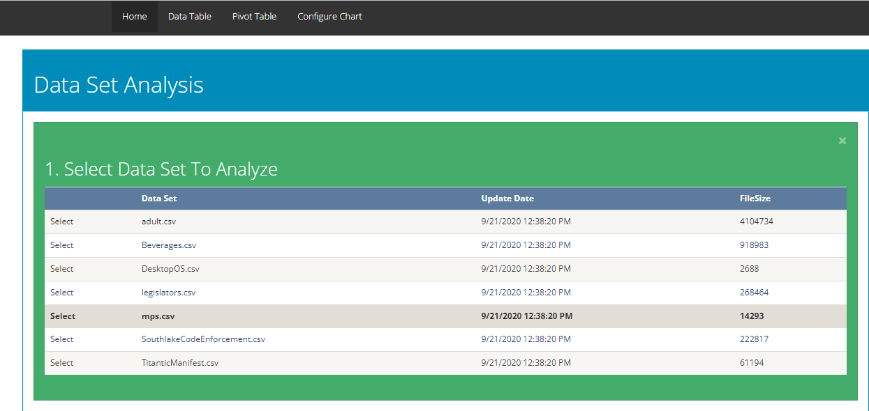
- CSV File Analysis
-
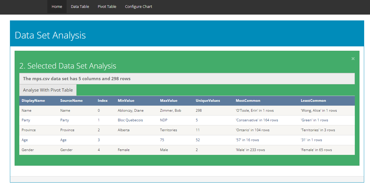
Users can select from a list of CSV files and analyze them in depth. The application provides an analysis of how many columns with basic attributes such as Min Value, Max Value, Unique Values, Most Common Value, Least Common Value, number of rows, and index position for each column.
Once a CSV file is selected, users can explore the data by creating custom charts and pivot tables. With the ability to save chart configurations, users can easily reproduce their work or share their findings with others.
- Pivoting Functionality
-
In addition to charting, the Data Analysis Demo leverages PivotTable.js, an open-source JavaScript library that enables users to explore and analyze data by turning a data set into a summary table. With drag-and-drop functionality, PivotTable.js makes it easy to manipulate the summary table, turning it into a pivot table or pivot chart that provides valuable insights into the data.
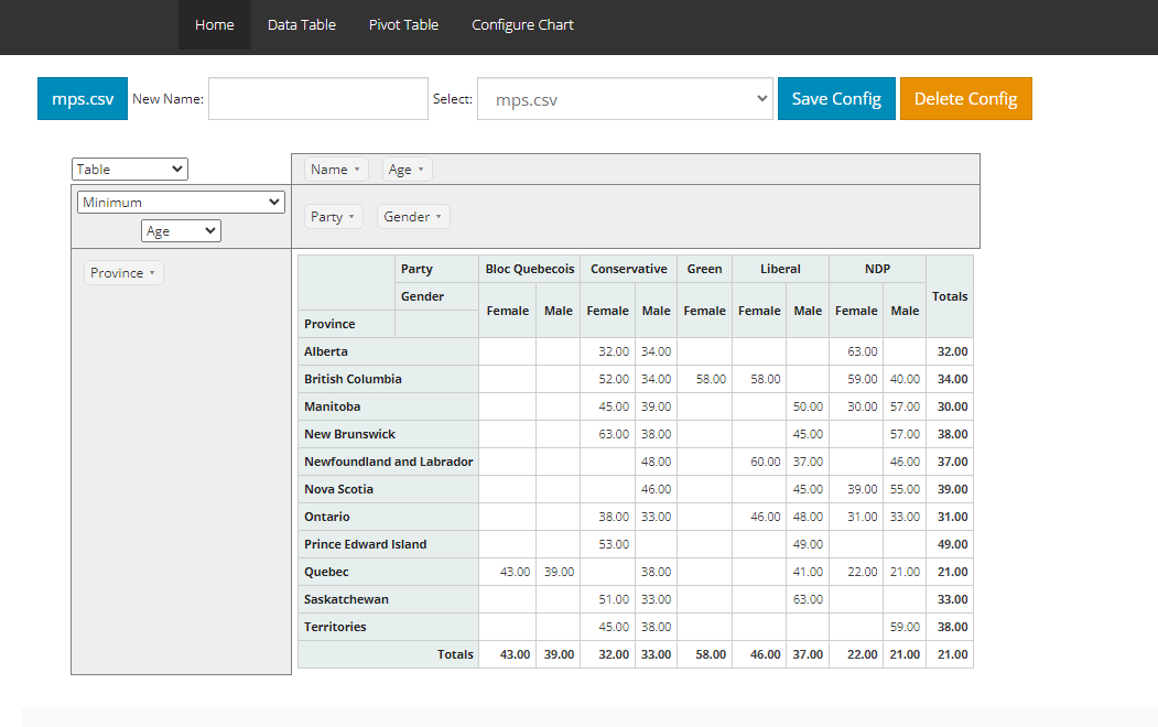
The Data Analysis Demonstration leverages PivotTable.js, an open-source JavaScript library that enables users to explore and analyze data by turning a data set into a summary table. With drag-and-drop functionality, PivotTable.js makes it easy to manipulate the summary table, turning it into a pivot table or pivot chart that provides valuable insights into the data. PivotTable.js' basic function is to enable data exploration and analysis by turning a data set into a summary table and then optionally adding a true 2-d drag-drop UI to allow a user to manipulate this summary table, turning it into a pivot table, very similar to the one found in older versions of Microsoft Excel with a bunch of extra developer-oriented features and some visualization effects. With optional add-ons, the summary table can be rendered as various kinds of charts, turning the pivot table into a pivot chart.
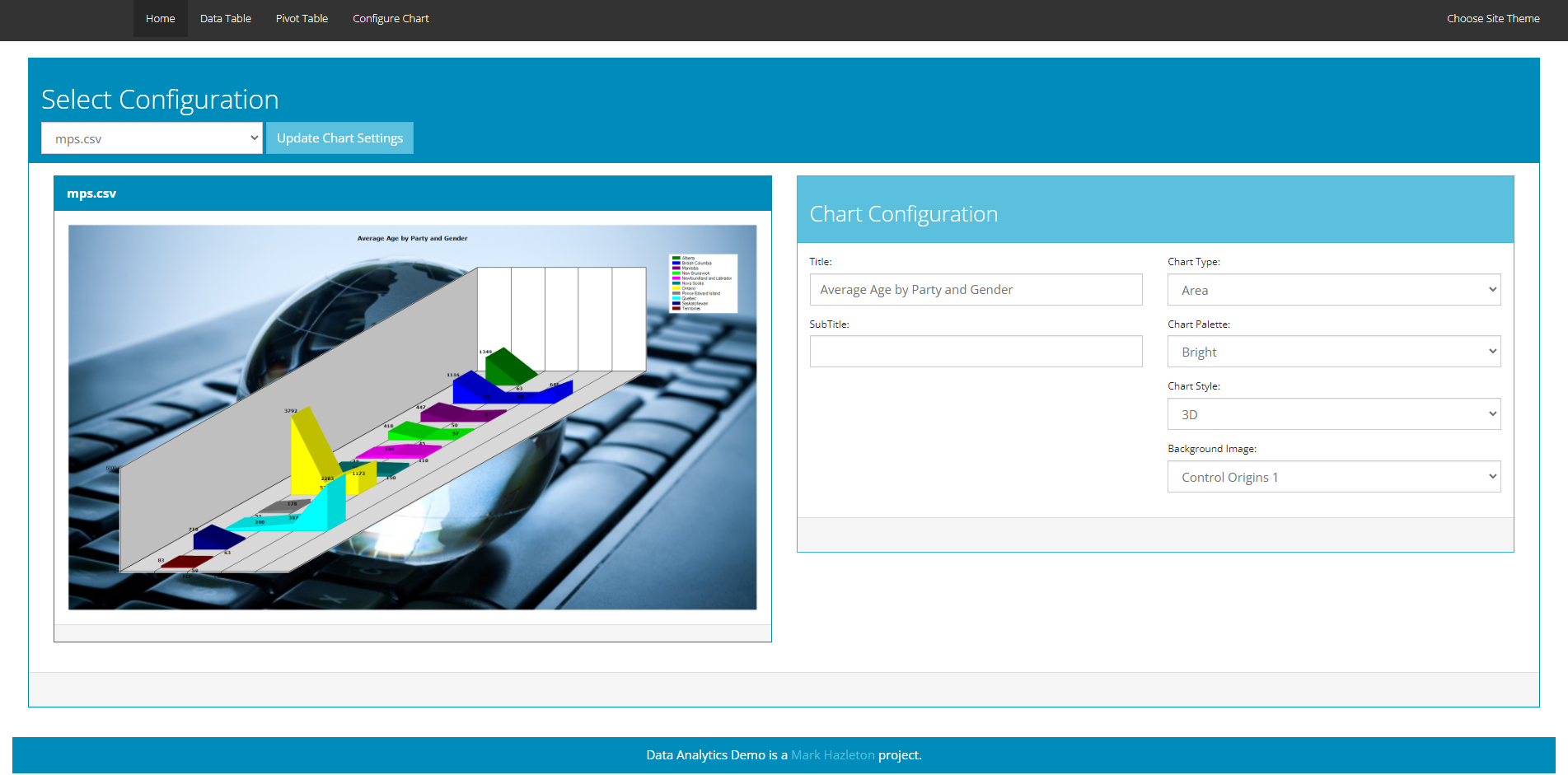
- Charting Functionality
-
The Data Analysis Demo's charting functionality uses the System.Web.UI.DataVisualization.Charting library from Microsoft. This customizable library provides a wide range of chart types, including line charts, bar charts, pie charts, and more. Users can save their chart configurations for future use, making it easy to reproduce their work or share their findings with others.
The Data Analysis Demonstration's powerful charting and pivoting functionality make it an ideal tool for anyone who needs to analyze and visualize data. Whether you're a business analyst, researcher, or developer, the application provides a user-friendly interface for exploring data and extracting valuable insights. With its customizable charting library and intuitive pivot table functionality, the Data Analysis Demonstration is a must-have tool for anyone who works with data.
The Data Analysis Demonstration's charting functionality uses the System.Web.UI.DataVisualization.Charting library from Microsoft. This library provides a wide range of chart types, including line charts, bar charts, pie charts, and more. The charting library is highly customizable, enabling users to tailor their charts to meet their specific needs. Users can also save their chart configurations for future use, making it easy to reproduce their work or share their findings with others.
- Timeless Utility
-
The Data Analysis Demo's powerful charting and pivoting functionality make it an ideal tool for anyone who needs to analyze and visualize data. Whether you're a business analyst, researcher, or developer, the application provides a user-friendly interface for exploring data and extracting valuable insights.
This is an old demonstration that has been updated to run on Microsoft Asp.Net Framework 4.8. While the application is old, it is still a relevant demonstration of data visualization in .Net web applications. It is nice to see that the application has aged well and continues to be a useful tool for data analysis.